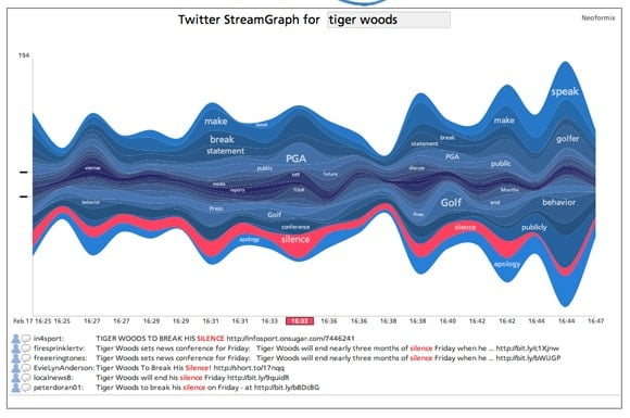
Four Ways of Looking at TwitterFebruary 25, 2010information design / TwitterVery cool stuff — experiments in data visualization as presented in the Harvard Business Review:Share this: Email a link to a friend (Opens in new window) Email Share on LinkedIn (Opens in new window) LinkedIn Share on Bluesky (Opens in new window) Bluesky Share on Mastodon (Opens in new window) Mastodon Share on Facebook (Opens in new window) Facebook Share on Reddit (Opens in new window) Reddit Share on X (Opens in new window) X Share on Pinterest (Opens in new window) Pinterest Share on Tumblr (Opens in new window) Tumblr Tags# information design# Twitter Previous Post Curling: An Olympic Sweep Next Post Santa Monica Restaurant to Close for Serving Illegal Whale Meat - Tonic Related PostsInfographic: The Literal Meaning Of Every State Name In The U.S.US debt problem visualized: Debt stacked in 100 dollar billsVisual Budget – an Interactive Guide to the Federal Budget