Infographic: The Literal Meaning Of Every State Name In The U.S.
Check out this awesome map of North America and the meanings behind our various geographical landmarks. >> Infographic: The Literal Meaning Of Every State Name In The U.S. | Co.Design
Check out this awesome map of North America and the meanings behind our various geographical landmarks. >> Infographic: The Literal Meaning Of Every State Name In The U.S. | Co.Design
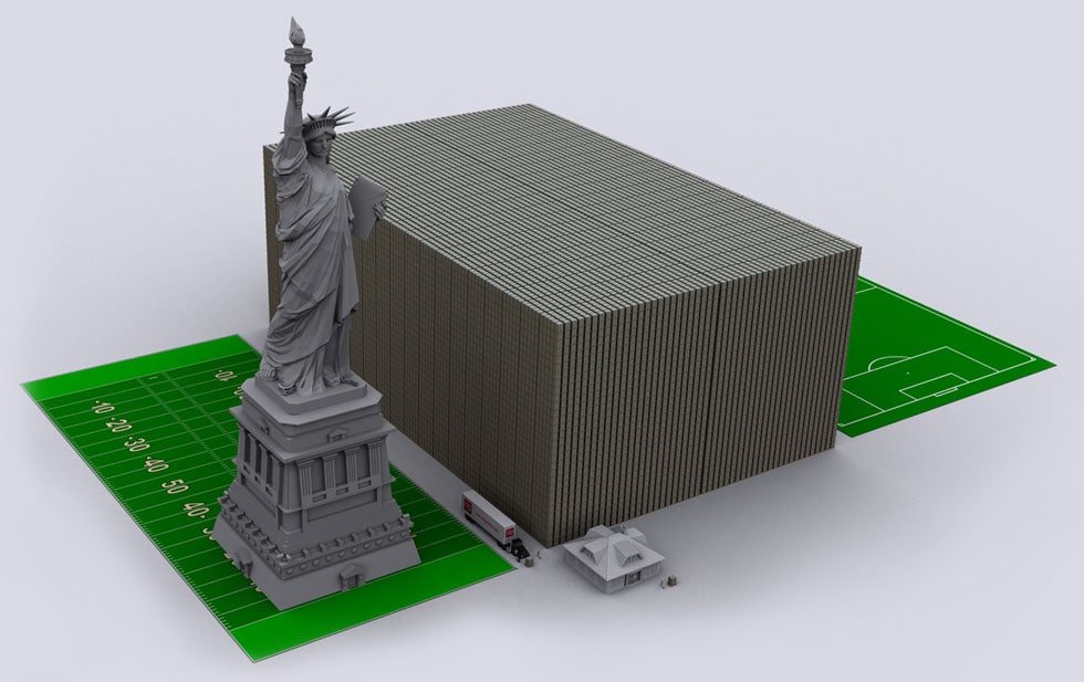
This is a brilliant information design project, and an astounding reminder of the scale of money we talk about in public finance. >> Link: US debt problem visualized: Debt stacked in 100 dollar bills.
From Information Aesthetics: Visual Budget is a cutting-edge data-visualization web site. It explains all the complicated ins and outs of the US Federal Budget using interactive charts and motion graphics. It is a tool that lets citizens like you and…
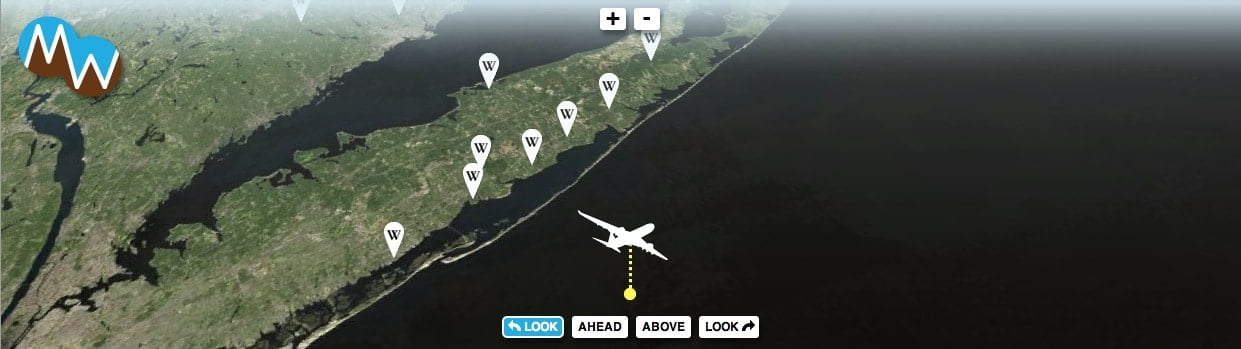
Super cool technology that lets you know what you’re looking at from 30,000 feet: The idea is that, if you’re online and in the air (and the Mondo Window guys have been blowing my mind with the technical, infrastructural and…
Thanks, Wikipedia! This is really useful:
What becomes of the printed word? What’s the fate of companies that produce periodicals and books? Here’s what 10 media and tech luminaries think: Link: 10 Sages read the future of print [Fortune]
Very cool stuff — experiments in data visualization as presented in the Harvard Business Review: